22nd December 2022
Poetic Evocations: Wintry Colours in Ceramics
“From heaven fall icy petals;
In the sky not a spot of blue remains.
A dusting of jade covers the ground
And buries the blue mountains.
The sun rises over the mountain peak.
The chill pierces my bones.
Silence prevails.”
— Musō Soseki (1275–1351)
trans. Edwin Cranston
The poem by Musō Soseki, one of the most influential Zen priests of the fourteenth century, evokes the wintry scene and sensations compelled by the colours of winter beyond the white colour of a snowscape. Embodying the Zen philosophy in being present and in touch with his own psyche, Soseki is able to conjure a strong imagery through a common emotive response to colours. Just as the dropping temperature and dark days can make us feel cold and sombre, and warm interiors and twinkling lights can make us feel warm and cosy, colours can elicit specific feelings and senses. Indeed, colours associated with the cold weather are not merely a reflection of what is visible, but rather, it reveals feelings embedded in stories and memories of the season.
The ceramicists at Maud and Mabel convey these senses through their art, drawing on colour as a language to express the introspective and almost meditative practice of crafting ceramics. This introspective and expressive act of making connect the artist and beholder — the poetic induction of winter in Soseki’s words can similarly be read in contemporary ceramics. As snow drifts over London and dusts the city in white, here are selected artists at Maud and Mabel working with colours relaying our version of winter.

Calligraphy by Musō Soseki of the poem on the theme of snow (The MET)
TETSUYA OZAWA
RUSTIC BRICK RED, CREAM AND BLACK
 Display of cream and black vases by Tetsuya Ozawa for Maud and Mabel
Tetsuya Ozawa uses black clay from Tokoname, Japan, a city known for its pottery production and combines it with the traditional chara glaze. The textures in Ozawa’s work creates a rustic authenticity — brick red is revealed through markings of the cream glaze, a sooty black belies the red and the deep red and white under the black glaze creates the effect of rust. The interruption to uniformity is achieved with the dusting technique of kofuki (also known as kohiki): the white slip is applied in a thin layer so the original clay body is visible underneath.

Cream and black plates (left) and brick red cup (right)
by Tetsuya Ozawa for Maud and Mabel
The rough textures of Ozawa’s ceramics create a feeling of serenity as it compels closer looking at the overlapping layers. The combination of the black and white with the subtle red is a reminder of the simplicity that the winter months can be, as the dark nights and white snow soften in our recollections of winter as we are protected within the confines of brick walls.
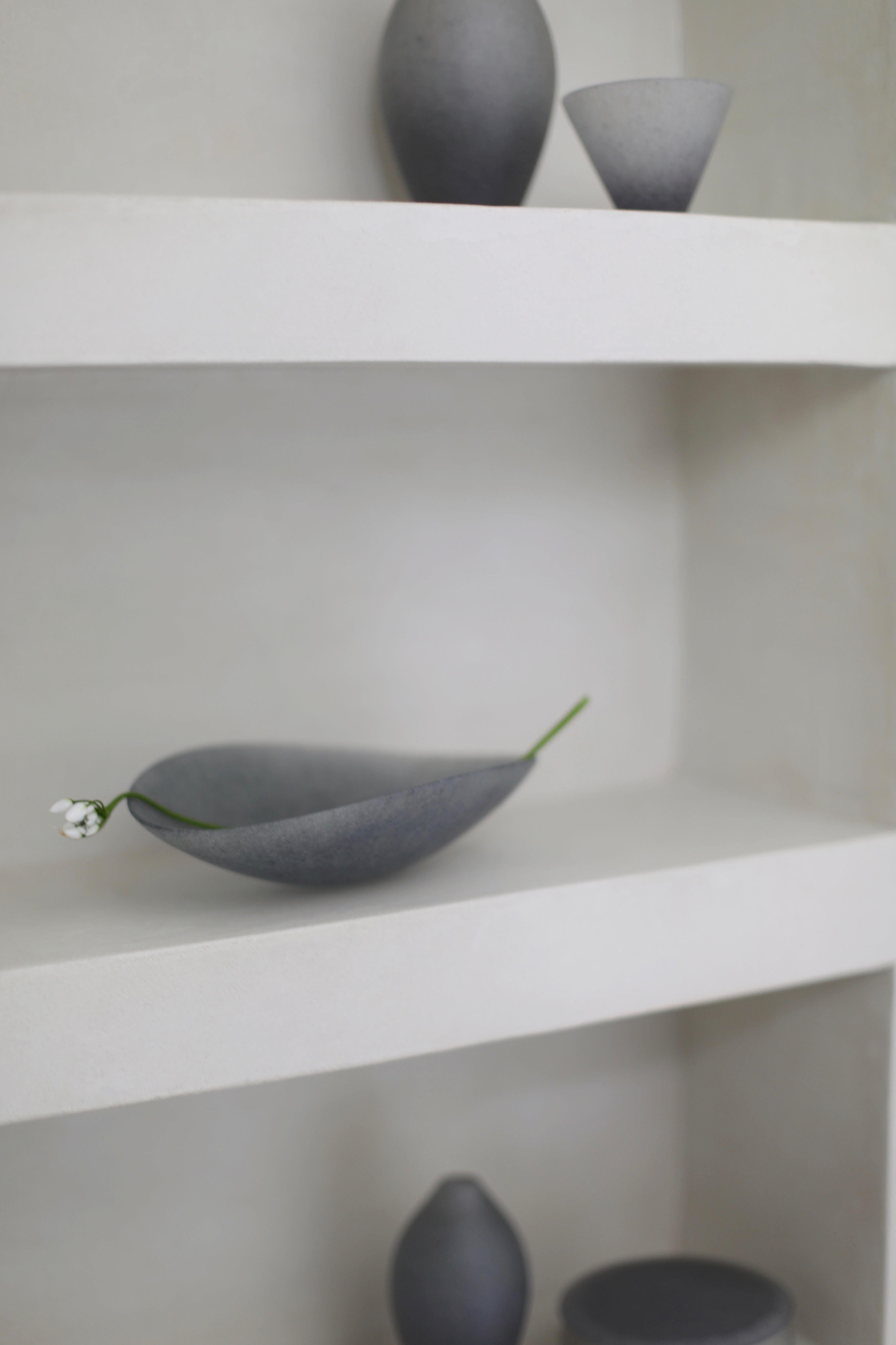
 Display of black vessels by Tetsuya Ozawa for Maud and Mabel
JACK DOHERTY
SMOKEY GREY, RUSSET, TURQUOISE
 Detail of soda-fired vessel by Jack Doherty
Jack Doherty uses one clay body, one colouring mineral and one single firing technique to create his works. The soda fired vessels retain marks from the flame — the vapour sodium oxide glaze interacts with the chemical properties of the slips and clay body according to the movement of flames in the kiln. The cool turquoise captures the chilly winter while the smokey grey and russet marks are reminiscent of the fireplace which comes alive this time of the year.

Vessels by Jack Doherty
Jack Doherty’s solo exhibition ‘Vocation’ at Maud and Mabel will run from 24th February – 11th March 2023.
BARRY STEDMAN
PLAYFUL PRIMARY COLOURS

A vessel (centre) and detailed views of vessels by Barry Stedman for Maud and Mabel
Barry Stedman works with red earthenware clay, oxides and underglazes. Each of his vessels are put through multiple firings to achieve their dynamism: after hand throwing or hand building each form, Barry uses thin washes, wipes back and builds up areas of colour before firing again, finishing each piece by glazing chosen areas. The range of all three primary colours: magenta, yellow and cyan in the vessels are the playful colours of lights and ornaments decorating spaces during the festive season. The painterly broad strokes of dark blue subdues the bright colours and adds a layer of complexity and solemnity to the expressive pieces exuding a sense of measured naivete.
 Blue, orange and yellow vessels by Barry Stedman for Maud and Mabel
ANETTE LINDENBERG
BEAUTY IN THE BLEAKNESS OF GREYS
“I really like grey tones because I like the way some clay looks before it is fired. A lot of people don’t — they think it looks too grey and bleak. The same way that I enjoy rain, I quite like bleakness, but in a beautiful way. I think sometimes you can take things like rain and grey pavements associated with bleakness, and reinterpret it in an object to make something beautiful… it’s different grey shades and tones that I seem to keep coming back to. I seem to have a thing about grey — grey and black.” — Annette Lindenberg

Frosted sky droplets tea bowl (top left), on snowy ground sake cup (top right), trapped metal tea bowl (bottom left) and crackled individual sake bottle (bottom right)
by Anette Lindenberg for Maud and Mabel
On a different note to the festivities of winter, the grey palette of Annette Lindenberg’s pieces offer a charming perspective to the bleakness of winter. Lindenberg hand builds or carves each of her pieces using the traditional Japanese technique of kurinuki, and experiments with glazes and reactions in firing clay, adding delicate elements like her silver droplets and crystalline crackles in the glaze. The intricate details are juxtaposed with textures and forms emulating the sublime nature and inspired by the quiet quotidian moments, encapsulating the serenity in the balance of a wabi-sabi aesthetic, where beauty is found in imperfections.
 Special collection ‘Quiet Thoughts’ by Anette Lindenberg for Maud and Mabel
To know more about Annette Lindenberg’s practice and artistic inspiration, read about our visit to her studio.
See Annette Lindenberg’s special collection ‘Quiet Thoughts’ for Maud and Mabel here.